ABOUT THE PROJECT
Tacit Tea
ROLE
UI/UX, Branding, Package Design
DATE
2023
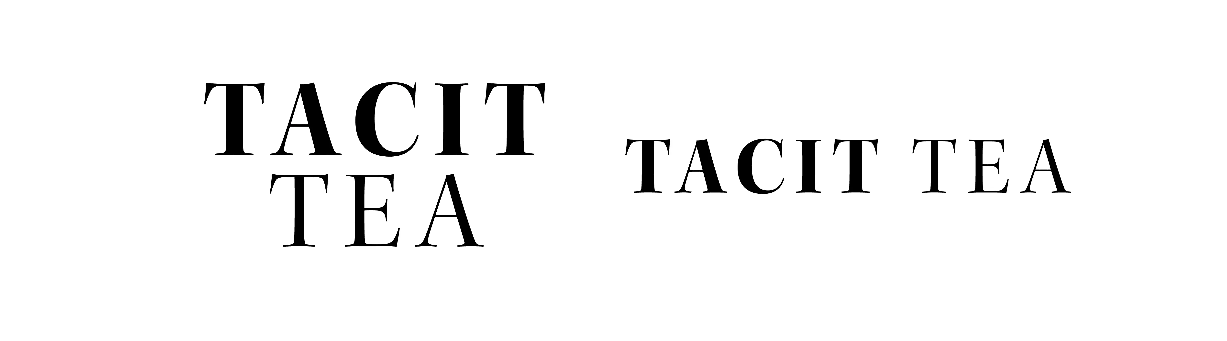
The branding utilizes a simply spaced serif font in order to accentuate the idea of tranquility and refinement of Japanese Tea.
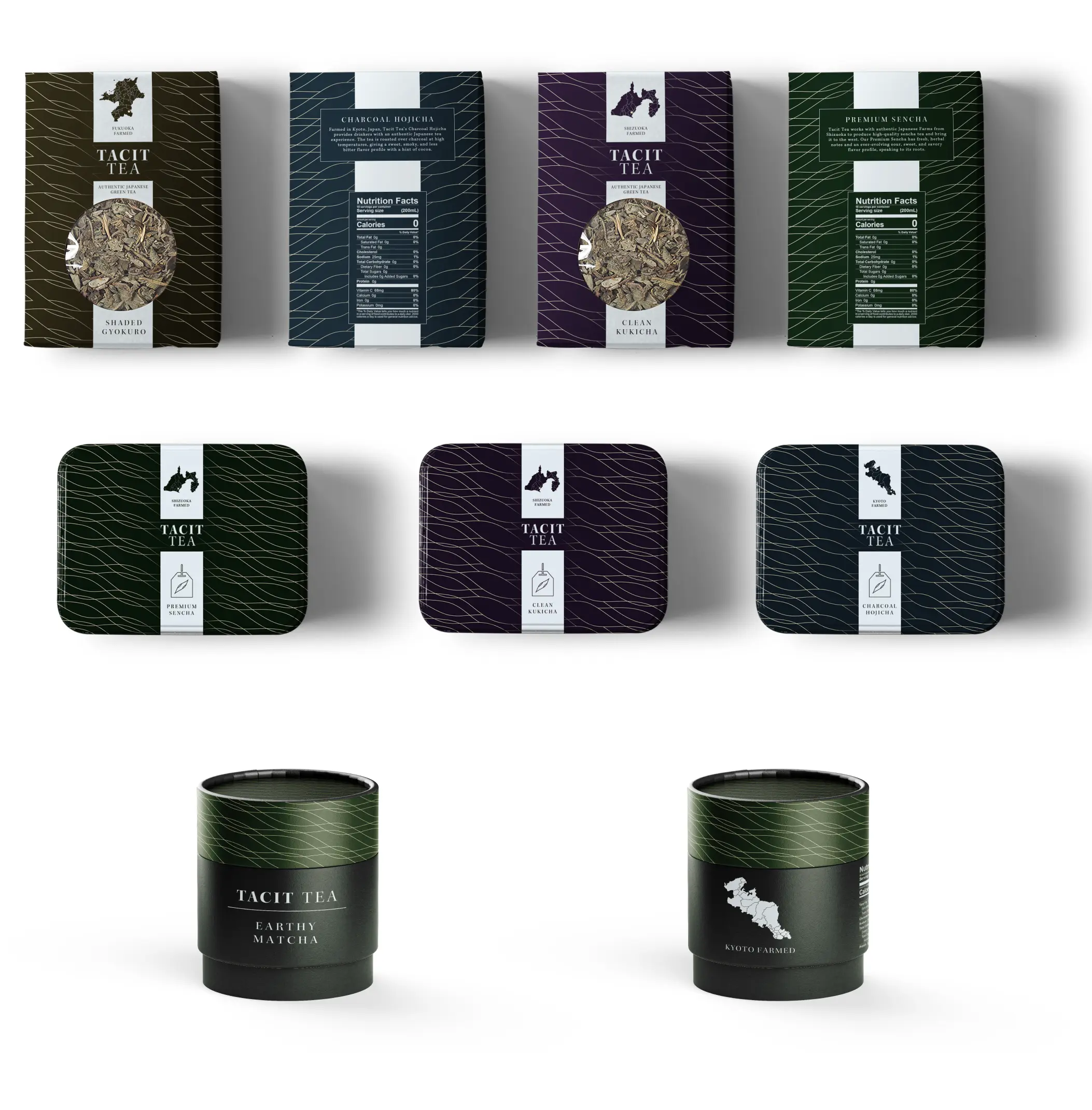
The packaging is unified through a similar yet slightly different pattern per color. It depicts the area the tea was farmed in Japan and uses the same refined typography as the logo. The white band and pattern give a feeling of quality and refinement.
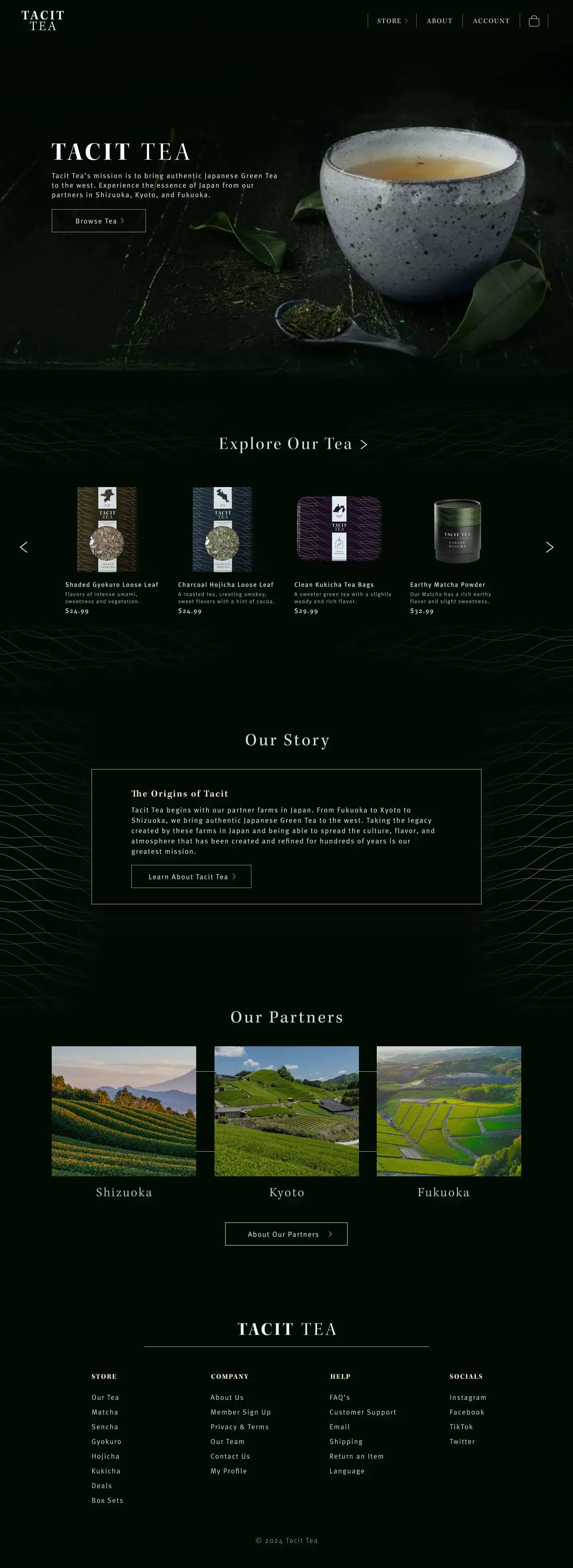
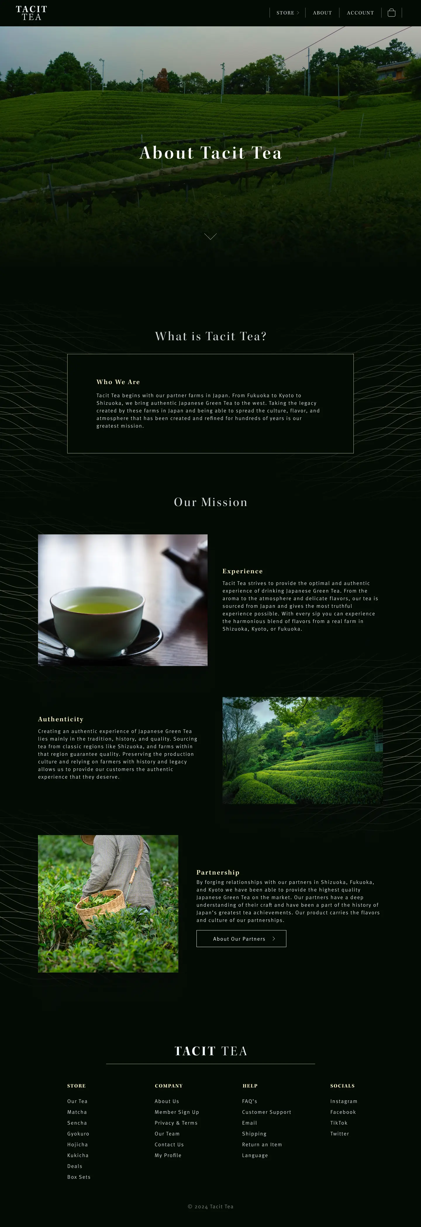
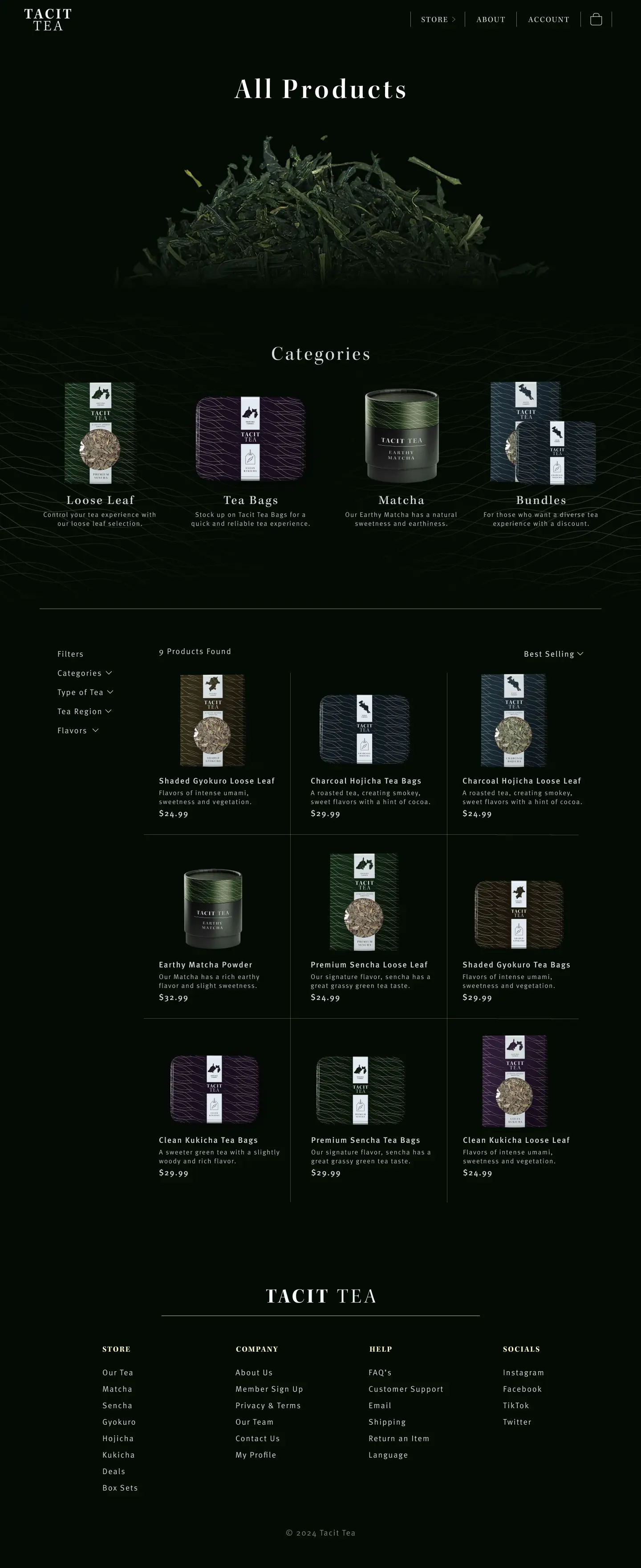
The website takes elements from the packaging and turns them into an experience. With the large pattern going throughout the website, along with the dark mode clean, modern aesthetic it pairs with the packaging well.